Client Portal Tour for Board Meeting
OverviewEquity Methods is a financial services firm specializing in equity compensation consulting. Following a private equity acquisition, the firm brought on a new CTO to drive modernization and growth, and hired its first UX designer to help build the digital products to get them there.
A major client, Meta, had directly expressed a desire for a more self-service experience, less back-and-forth email, more autonomy. That signal, combined with board-level pressure for modernization, made the portal both a strategic priority and a litmus test for the firm's ability to evolve.
The Problem: Growing fast, operating on legacy process
Equity Methods was growing fast and needed a digital presence to match, giving clients a modern portal to interact with the firm, find what they need, and manage their account on their own terms rather than through phone and email.
"Our clients trust us because we make things easy for them. The less they have to chase us, the better."
Clayton, internal discoveryI ran discovery interviews with consultants across all service lines, managing directors, and the CEO. The goal was to understand the client relationship from the inside out, what information consultants needed, how clients currently interacted with the firm, and where the biggest friction points were. I also ran polls with leadership to align on branding direction and collaborated with marketing on visual identity.
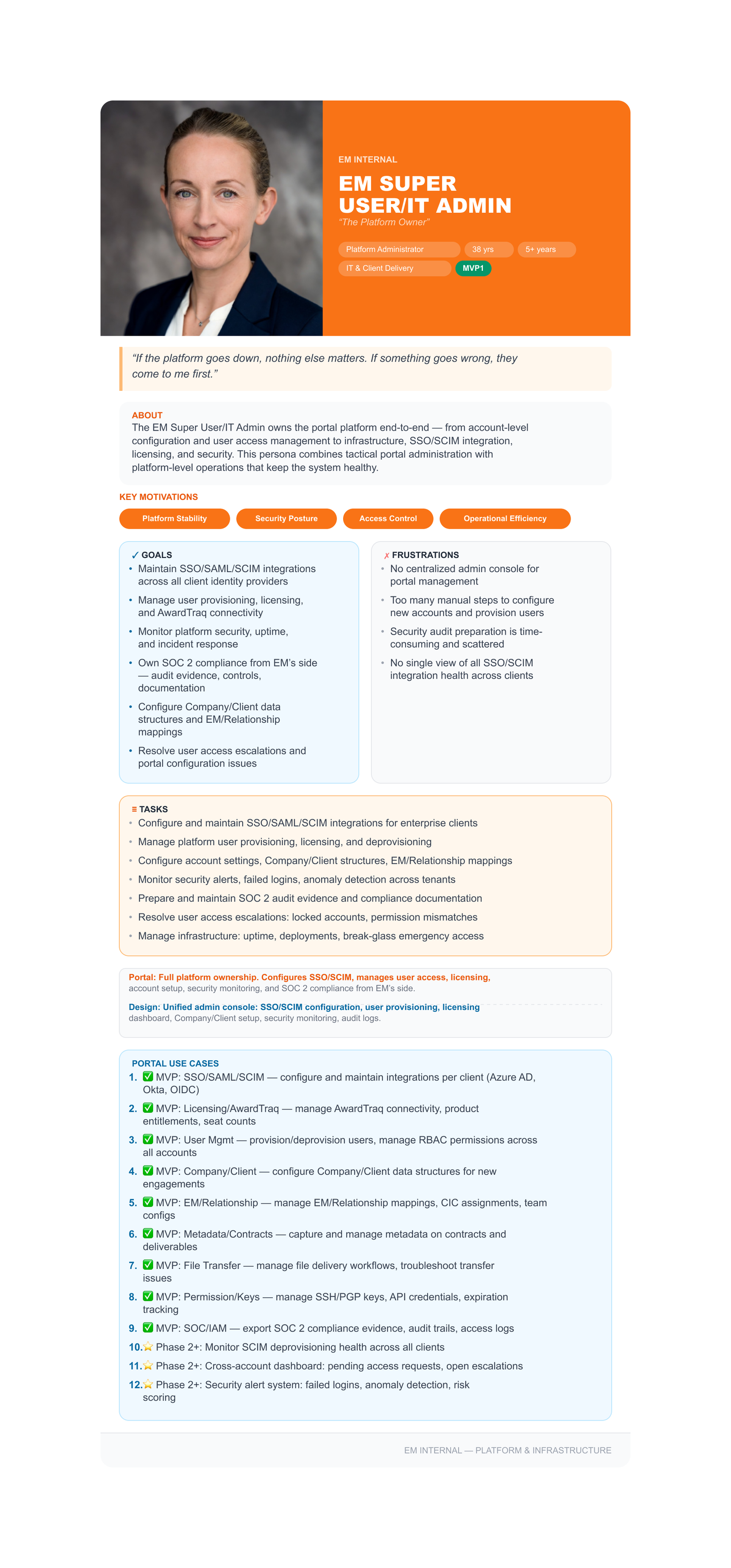
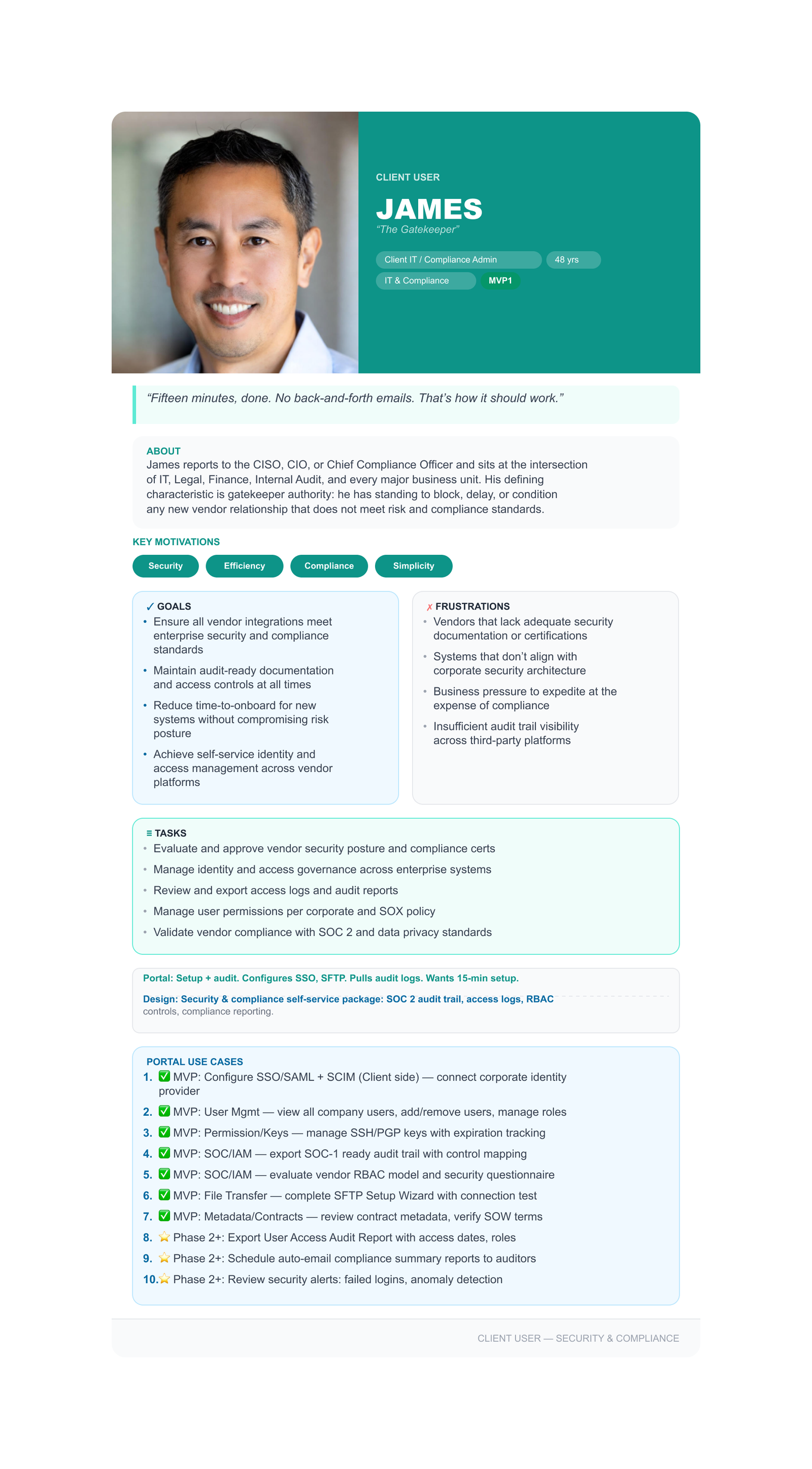
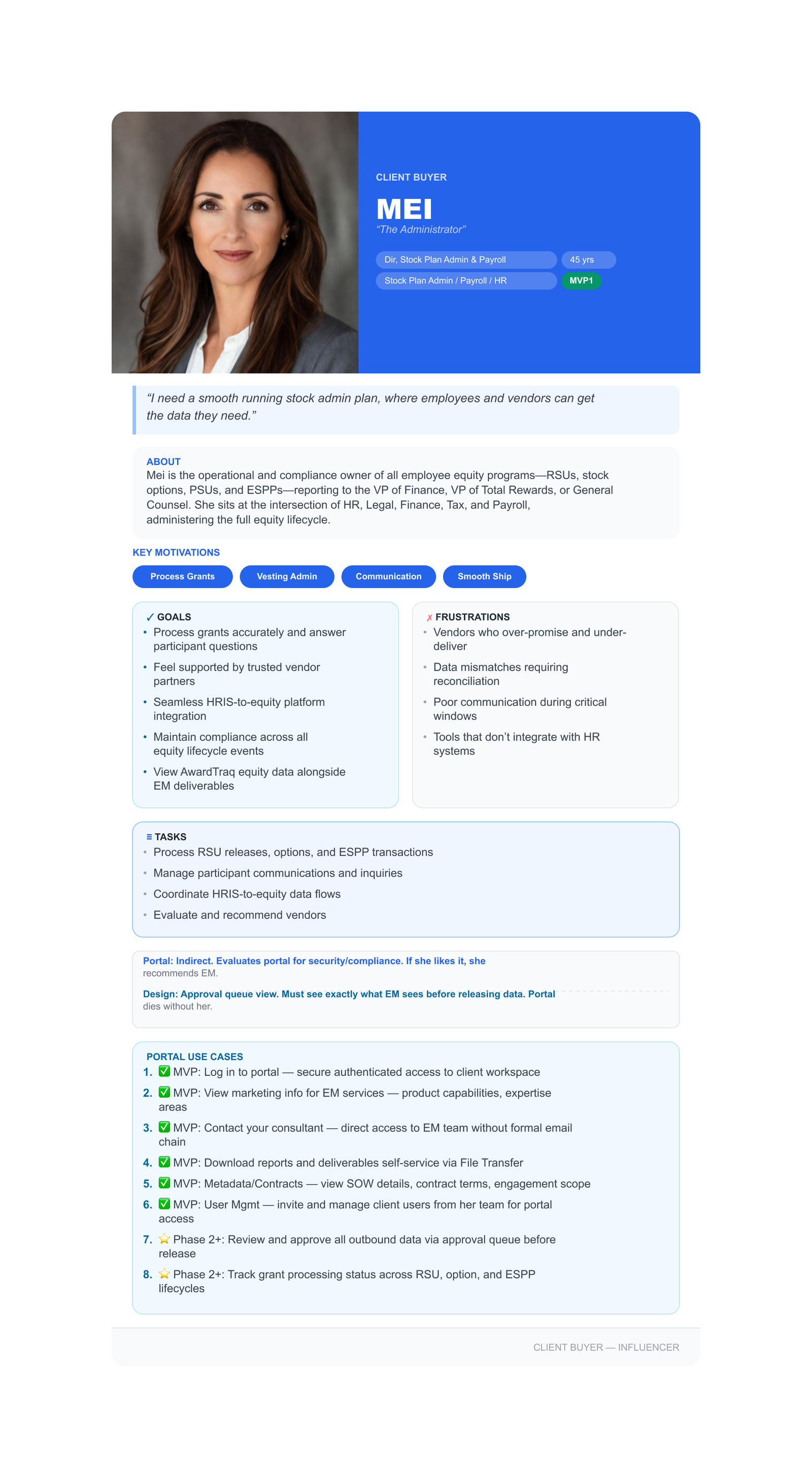
User Personas
Information Architecture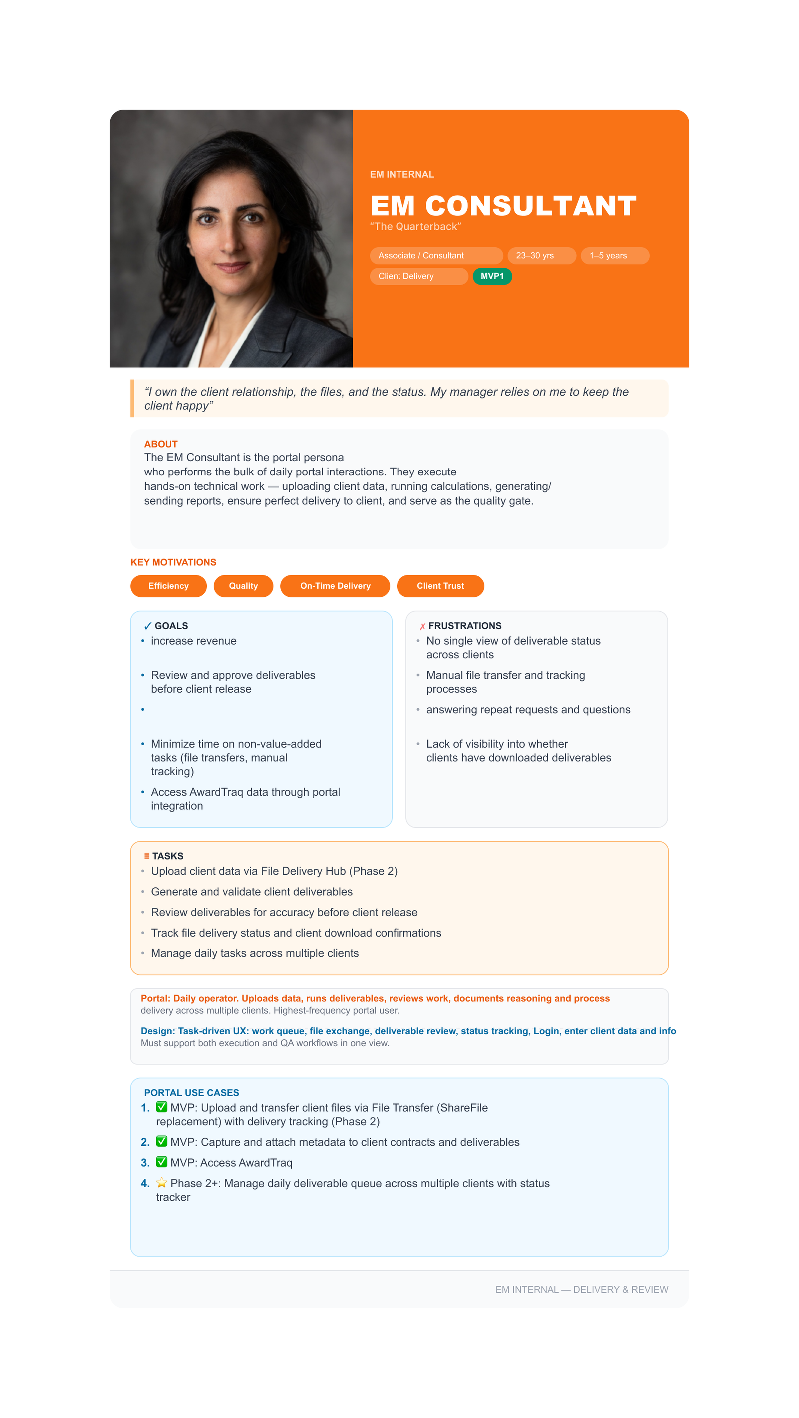
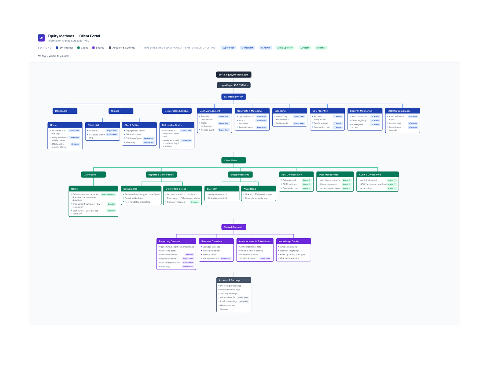
Early in the process I established the portal's structure: two distinct user experiences under one shell. Clients and consultants needed different navigation, different data access, and different visual contexts, but the same underlying component system. That architectural decision shaped everything that followed.
 Wireframes & Prototyping
Because stakeholders couldn't engage with low-fidelity wireframes, I moved to high-fidelity mockups early using Figma Make and Claude Code. Discovery still happened through feedback sessions, sketching with stakeholders directly to work through navigation patterns, layout, and how components should function and relate to each other. The challenge that followed was helping the team understand that an AI-generated prototype and a production-ready product are not the same thing.
Visual DesignTwo views, one product
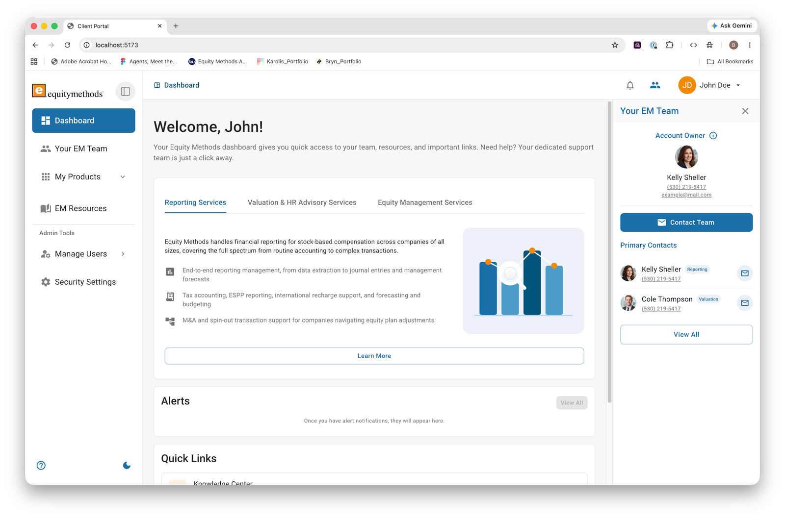
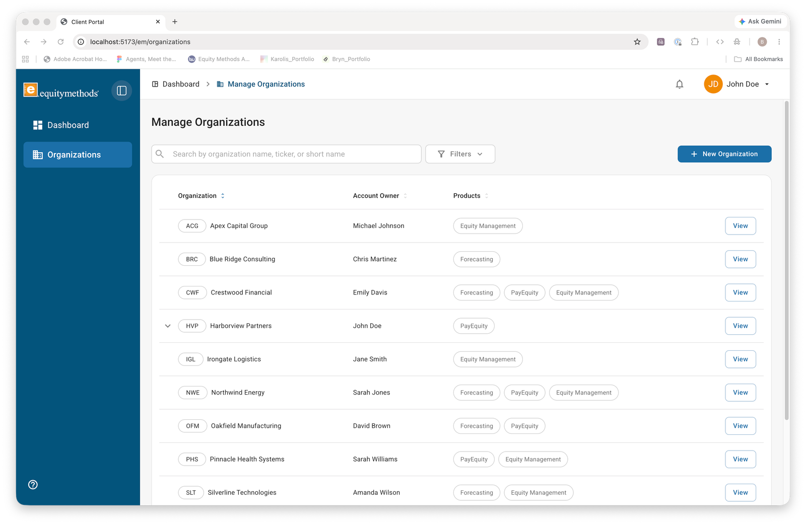
The consultant and client experiences needed to feel like the same product while being clearly distinct. The approach was a shared MUI component library with view-specific color treatments in the navigation, subtle enough to stay on-brand, distinct enough that a consultant couldn't mistake which context they were operating in.
Orange is the brand. Orange is also a WCAG problem.
EM's primary brand color is a strong orange, distinctive and recognizable. It's also a contrast challenge against white backgrounds at small text sizes. WCAG 2.1 AA requires a 4.5:1 ratio for normal text, and EM's orange doesn't meet that at full saturation.
The solution was to treat orange as an accent, not a workhorse. It signals interactive states, active items, and key actions, never body text, never small labels. Where orange had to carry meaning, surrounding context (size, weight, proximity) did the accessibility work instead.
EM's primary orange fails the 4.5:1 contrast threshold against white at regular text sizes. Every component was tested against WCAG criteria before moving to prototype. Orange was reserved for large interactive elements and decorative accents only.

Onboarding as a system
New users got three overlapping entry points: a wizard for step-by-step account setup, a spotlight tour for first-login orientation, and a persistent setup checklist until the account was fully configured. The redundancy was intentional — a confused first session reflects on the firm, not just the product.
Scope| Feature | Audience | What it replaces or enables |
|---|---|---|
| Dashboard | Both | Two distinct views with different navigation and color treatment to signal context |
| Onboarding wizard | Client | Guided setup without a support touchpoint |
| Spotlight tour | Client | In-product orientation on first login |
| Setup checklist | Client | Persistent task list until account is fully configured |
| Manage users | Admin | Self-service user management without a support ticket |
| Bulk upload | Admin | Large file ingestion with clear error and success states |
| Provisioning & invite tracking | Admin | Visibility into who is invited, accepted, or pending |
| Security settings | Admin | SSO config, session controls, access management |
| Profile settings | Both | Personal info that also feeds the Friends of the Firm list |
| Notifications | Both | In-product alerts for activity and pending actions |
| Support requests | Client | Structured intake that routes to the right consultant |
| Your EM team page | Client | See the team, learn roles, email the correct distribution list |
| Services visibility | Client | Passive discovery of EM capabilities, marketing without selling |
| Company list | Consultant | All client companies and contacts, replaces the spreadsheet |
| Client notes | Consultant | Per-client context that stays with the account |
| Billing contacts | Consultant | Reliable billing info for accounting |
How much of the work was about earning trust before anyone would engage with the product. Many people at the firm were proud of how they worked and saw a digital product as a threat to that. Getting them on board required as much thought as the design itself.
Establish a real cadence from day one. We moved by building screens, showing them, and building more with no shared milestones. The business side lost the thread of what we were doing, and I underestimated how much process I'd need to create myself.
The ability to move without waiting for direction. With no project manager and a team figuring things out in real time, I got comfortable making decisions independently and treating ambiguity as part of the job rather than a problem to solve first.
That I can own a product end to end, from research and strategy through design and front-end code, in an industry I had to learn on the fly, with a team that was building the plane while flying it.